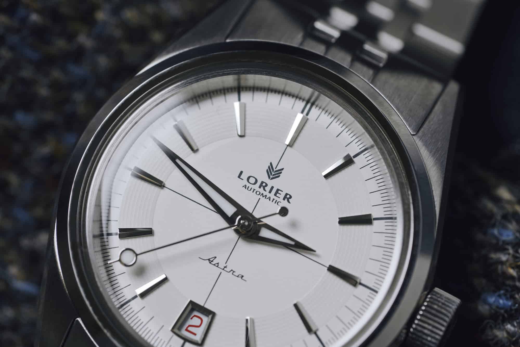
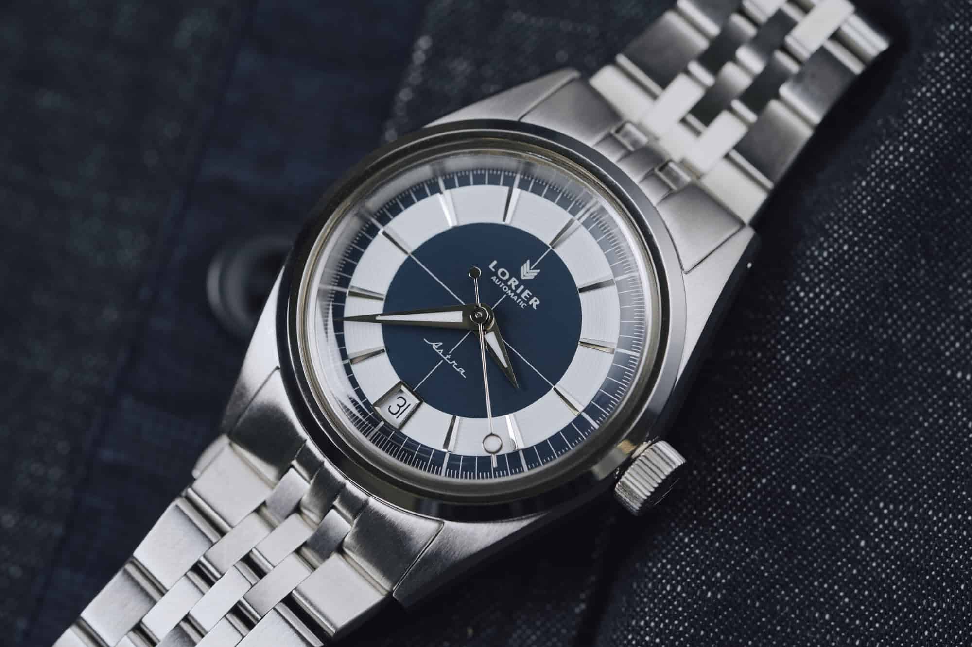
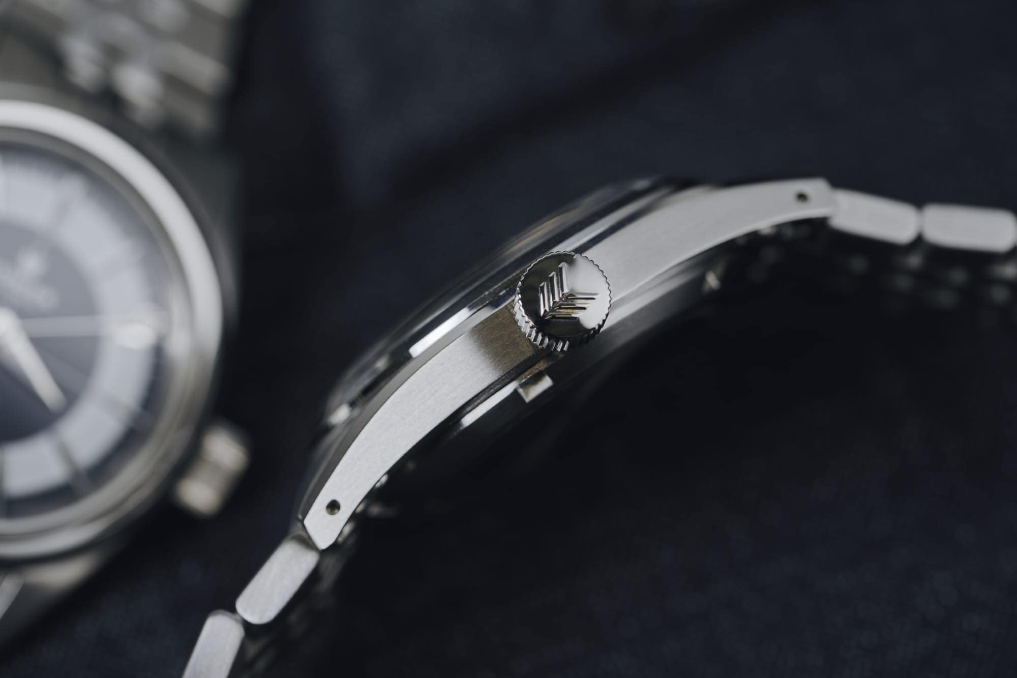
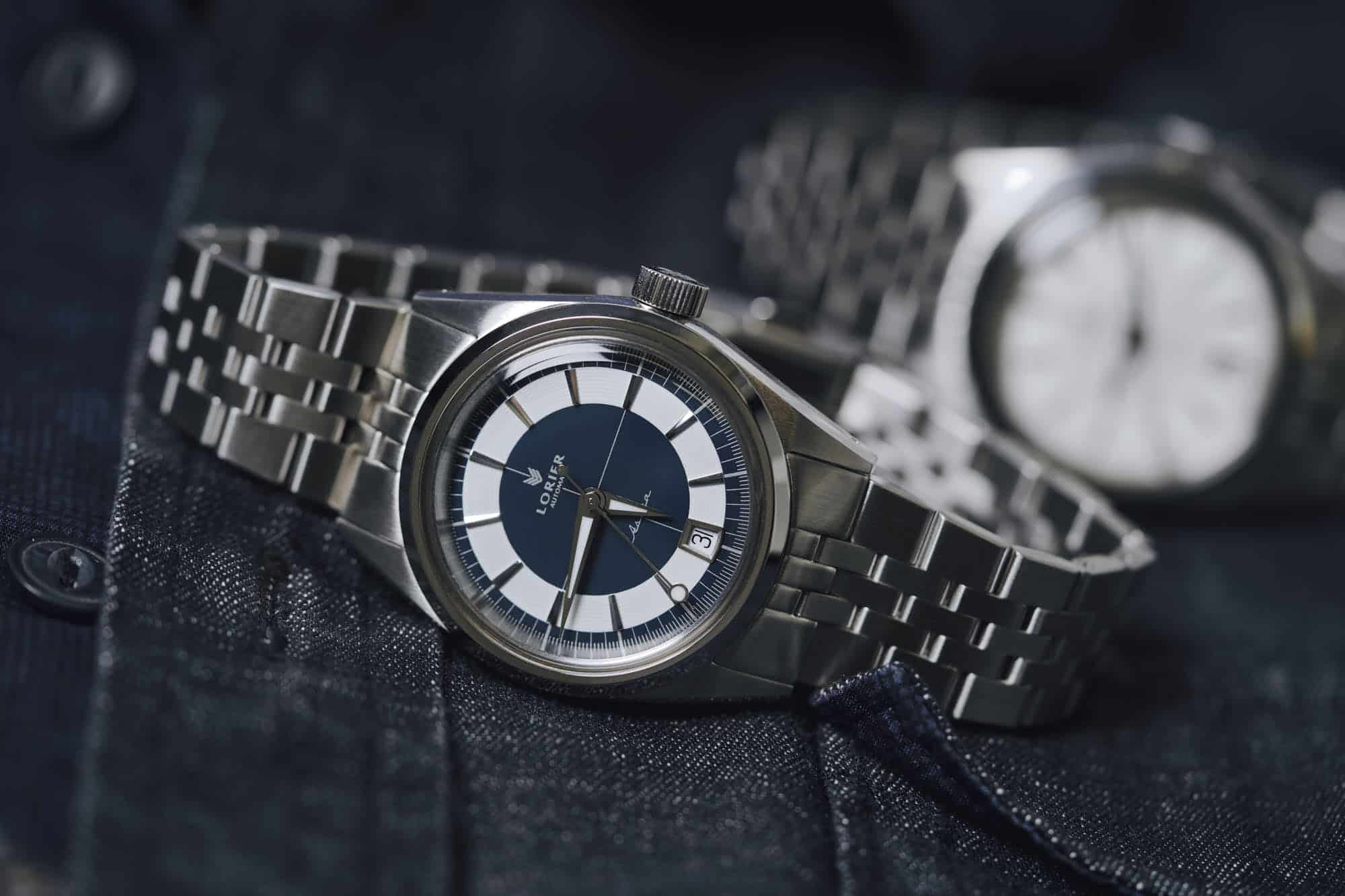
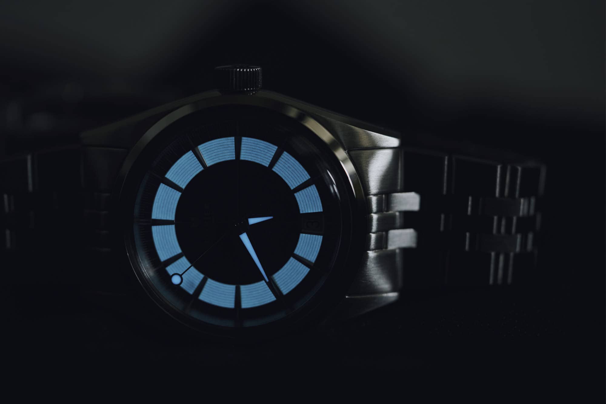
These dials are the standout feature of the Astra. The distinct combination of printed dial features, applied markers, and luminous elements offers a unique wearing experience among Lorier watches. The Astra’s dial is rooted in two sought after vintage aesthetics, the crosshair dial and the sector dial.
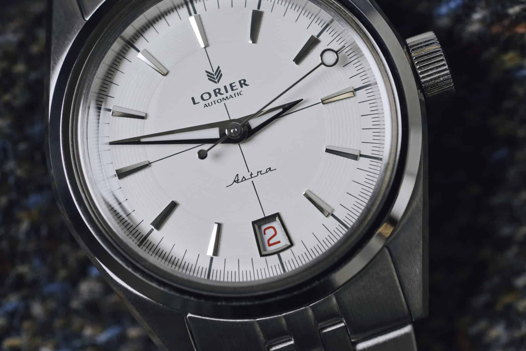
While the crosshair design reaches across the centermost portion of the dial, connecting the makers, the luminous ring of BGW9 Superluminova is clearly the more eye-catching dial feature, especially on the Cosmic Blue dial, where it sits in stark contrast to the deep blue of the dial. This tracked luminous ring draws direct inspiration from the “Nitelite” marker rings found on certain old Polerouters, and provides a lovely framing device for the whole of the well laid out dial. A roulette date wheel gives the watch a welcome pop of color on even numbered dates, although I found it to have less of a notable impact on the Cosmic Blue option than on the white.
The Lorier logo, with its delightful Chevron, and the ‘50s-esque cursive Astra word-mark slightly break up the vertical line of the crosshair and, along with the modified (and lumed) dauphine hands, feel right at home on the dial of the Astra. I will say, for as much as I enjoyed the Astra overall, those hands felt like potentially the one real weakness in the watch.
![]()
The more I looked at them, the more I felt like they were ever-so-slightly out of proportion with one another. On future versions of the Astra, I might prefer to see a slightly longer hour hand paired with a slightly shorter minute hand, as well as the shifting of the luminous pip further down the seconds hand toward the center of the dial. On a watch that gets so many of the subtle details right, I am hesitant to gripe about such small misses, but I think it speaks to just how well the rest of the watch is designed that I even noticed.
The overall effect of the watch proves vastly different depending on which color Astra one chooses. The Cosmic Blue is, without a doubt, the slightly bolder choice (though neither option feels particularly like a stretch). It makes itself known in a way that the white tries to avoid, and generally presents a slightly sportier aesthetic than its opaline counterpart. The deepness of the blue also feels a hair more contemporary, in a way that some might like, and others might reject if truly in search of a vintage aesthetic.
For me, the white feels like the way to go. The subtlety of the luminous ring, the increased impact of the roulette date wheel, and the monotone quality of the watch mean that the Core Collection Astra feels like a watch, no more, no less. In fact, it may well be my new answer when someone randomly asks me, “what watch should I get?”
![]()
The Lorier Astra hits every point it needs to, stripping out all the obvious, and adding back in nothing but the meaningful. It’s the sort of watch I could have seen my grandfather walking into a boutique, picking out of the display case, and wearing to death for the next 40 years without a second thought — and that’s a hell of a thing.
The Lorier Astra is currently available for Pre-Order in either color on the Lorier website, with an expected delivery date of Spring or Summer 2024. Lorier






 Featured Videos


